I thought it would be easier to place the logo if it - Story 17
I thought it would be easier to place the logo if it - Story 17. pages 1-31. • This is part 1 of the final candidates. •Personally, I was
 1/31
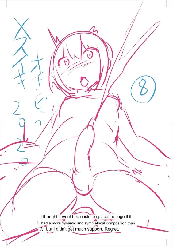
1/31I thought it would be easier to place the logo if it had a more dynamic and symmetrical composition than O, but I didn't get much support. Regret.
I thought it would be easier to place the logo if it had a more dynamic and symmetrical composition than O, but I didn't get much support. Regret.
 2/31
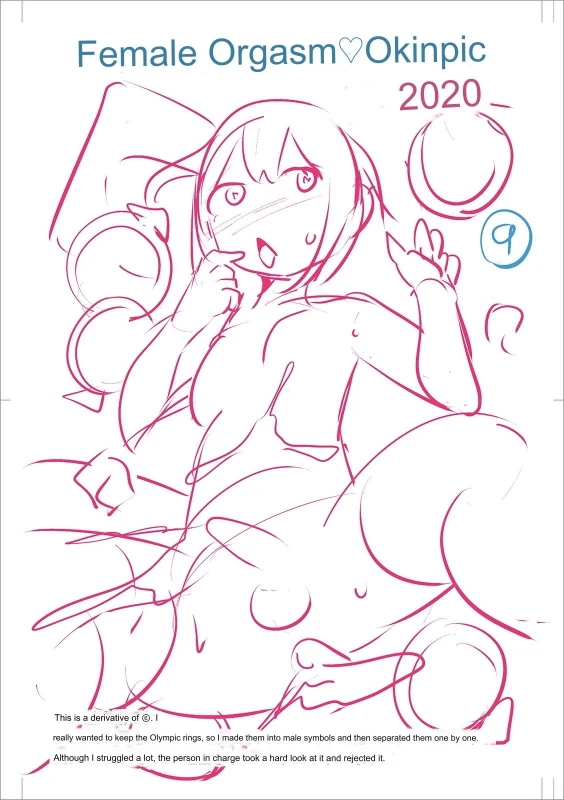
2/31Female Orgasm Okinpic 2020- This is a derivative of g. 1 really wanted to keep the Olympic rings, so I made them into male symbols and then separated them one by one. Although I struggled a lot, the person in charge took a hard look at it and rejected it.
Female Orgasm Okinpic 2020- This is a derivative of g. 1 really wanted to keep the Olympic rings, so I made them into male symbols and then separated them one by one. Although I struggled a lot, the person in charge took a hard look at it and rejected it.
 3/31
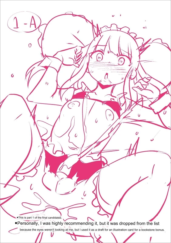
3/31• This is part 1 of the final candidates. •Personally, I was highly recommending it, but it was dropped from the list because the eyes weren't looking at me, but I used it as a draft for an illustration card for a bookstore bonus.
• This is part 1 of the final candidates. •Personally, I was highly recommending it, but it was dropped from the list because the eyes weren't looking at me, but I used it as a draft for an illustration card for a bookstore bonus.
 4/31
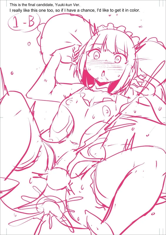
4/31This is the final candidate, Yuuki-kun Ver. I really like this one too, so if I have a chance, I'd like to get it in color.
This is the final candidate, Yuuki-kun Ver. I really like this one too, so if I have a chance, I'd like to get it in color.
 5/31
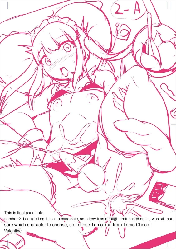
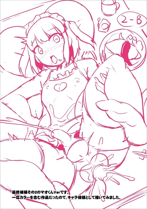
5/31A This is final candidate sure which character to choose, so I chose Tomo-kun from Tomo Choco number 2. I decided on this as a candidate, so I drew it as a rough draft based on it. I was still not Valentine.
A This is final candidate sure which character to choose, so I chose Tomo-kun from Tomo Choco number 2. I decided on this as a candidate, so I drew it as a rough draft based on it. I was still not Valentine.
 6/31
6/31—mh>—@8U#эt:DC.‡+5HŁU#UÇæšЬ
 7/31
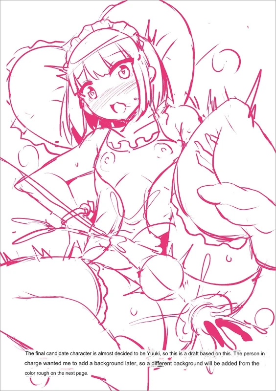
7/31The final candidate character is almost decided to be Yuuki, so this is a draft based on this. The person in charge wanted me to add a background later, so a different background will be added from the color rough on the next page.
The final candidate character is almost decided to be Yuuki, so this is a draft based on this. The person in charge wanted me to add a background later, so a different background will be added from the color rough on the next page.
 8/31
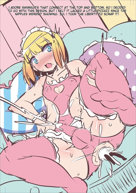
8/31TO GO WITH THIS DESIGN, BUT I FELT IT LACKED A LITTLE PIZZAZZ SINCE THE I ADORE SWIMSUITS THAT CONNECT AT THE TOP AND BOTTOM, SO I DECIDED NIPPLES WEREN'T SHOWING. SO, I TOOK THE LIBERTY TO SCRAP IT!
TO GO WITH THIS DESIGN, BUT I FELT IT LACKED A LITTLE PIZZAZZ SINCE THE I ADORE SWIMSUITS THAT CONNECT AT THE TOP AND BOTTOM, SO I DECIDED NIPPLES WEREN'T SHOWING. SO, I TOOK THE LIBERTY TO SCRAP IT!
 9/31
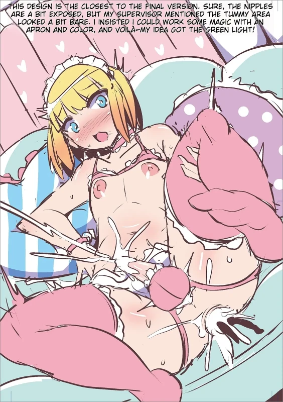
9/31THIS DESIGN IS THE CLOSEST TO THE PINAL VERSION. SURE, THE NIPPLES ARE A BIT EXPOSED, BUT MY SUPERVISOR MENTIONED THE TUMMY AREA LOOKED A BIT BARE. I INSISTED I COULD WORK SOME MAGIC WITH AN APRON AND COLOR, AND VOILA-MY IDEA GOT THE GREEN LIGHT!
THIS DESIGN IS THE CLOSEST TO THE PINAL VERSION. SURE, THE NIPPLES ARE A BIT EXPOSED, BUT MY SUPERVISOR MENTIONED THE TUMMY AREA LOOKED A BIT BARE. I INSISTED I COULD WORK SOME MAGIC WITH AN APRON AND COLOR, AND VOILA-MY IDEA GOT THE GREEN LIGHT!
 10/31
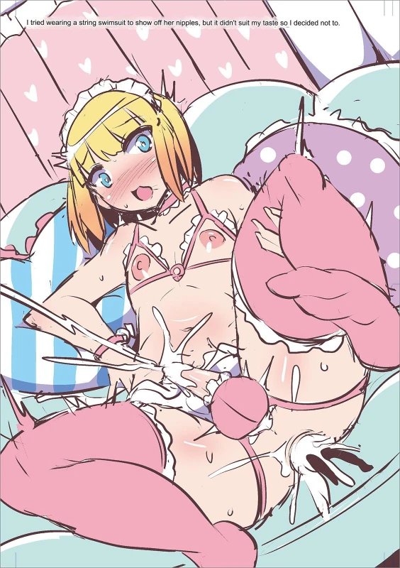
10/31I tried wearing a string swimsuit to show off her nipples, but it didn't suit my taste so decided not to.
 11/31
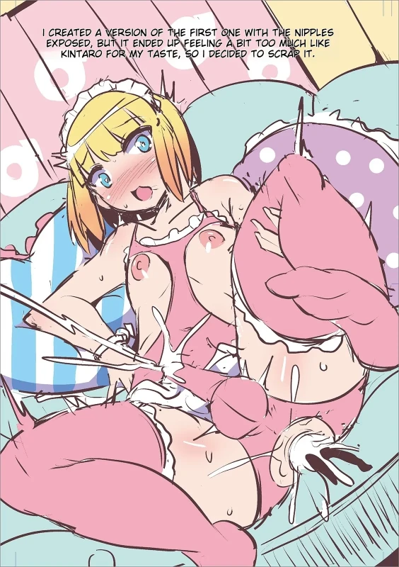
11/31I CREATED A VERSION OF THE FIRST ONE WITH THE NIPPLES EXPOSED, BUT IT ENDED UP FEELING A BIT TOO MUCH LIKE KINTARO FOR MY TASTE, SO I DECIDED TO SCRAP IT.
I CREATED A VERSION OF THE FIRST ONE WITH THE NIPPLES EXPOSED, BUT IT ENDED UP FEELING A BIT TOO MUCH LIKE KINTARO FOR MY TASTE, SO I DECIDED TO SCRAP IT.
 12/31
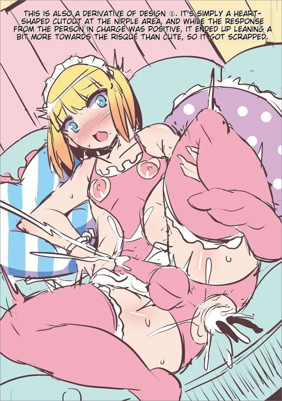
12/31SHAPED CUTOUT AT THE NIPPLE AREA, AND WHILE THE RESPONSE THIS IS ALSO A DERIVATIVE OF DESIGN @. IT'S SIMPLY A HEART- FROM THE PERSON IN CHARGE WAS POSITIVE, IT ENDED UP LEANING A BIT MORE TOWARDS THE RISQUE THAN CUTE, SO IT GOT SCRAPPED.
SHAPED CUTOUT AT THE NIPPLE AREA, AND WHILE THE RESPONSE THIS IS ALSO A DERIVATIVE OF DESIGN @. IT'S SIMPLY A HEART- FROM THE PERSON IN CHARGE WAS POSITIVE, IT ENDED UP LEANING A BIT MORE TOWARDS THE RISQUE THAN CUTE, SO IT GOT SCRAPPED.
 13/31
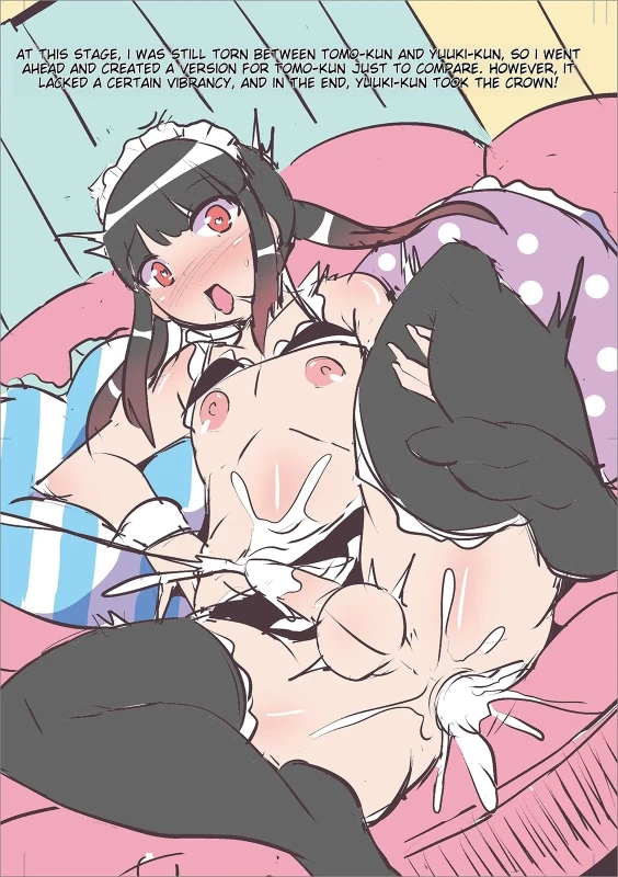
13/31AT THIS STAGE, I WAS STILL TORN BETWEEN TOMO-KUN AND YULKI-KUN, SO I WENT AHEAD AND CREATED A VERSION FOR TOMO-KUN JUST TO COMPARE. HOWEVER, IT LACKED A CERTAIN VIBRANCY, AND IN THE END, YUUKI-KUN TOOK THE CROWN!
AT THIS STAGE, I WAS STILL TORN BETWEEN TOMO-KUN AND YULKI-KUN, SO I WENT AHEAD AND CREATED A VERSION FOR TOMO-KUN JUST TO COMPARE. HOWEVER, IT LACKED A CERTAIN VIBRANCY, AND IN THE END, YUUKI-KUN TOOK THE CROWN!
 14/31
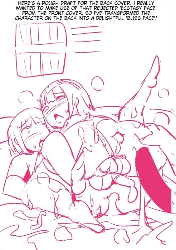
14/31HERE'S A ROUGH DRAFT FOR THE BACK COVER. I REALLY WANTED TO MAKE USE OF THAT REJECTED 'ECSTASY FACE' HARACTER ON THE BACK INTO A DELIGHTFUL BLISS FACE!
HERE'S A ROUGH DRAFT FOR THE BACK COVER. I REALLY WANTED TO MAKE USE OF THAT REJECTED 'ECSTASY FACE' HARACTER ON THE BACK INTO A DELIGHTFUL BLISS FACE!
 15/31
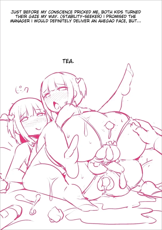
15/31JUST BEFORE MY CONSCIENCE PRICKED ME, BOTH KIDS TURNED THEIR GAZE MY WAY. (STABILITY-SEEKER) I PROMISED THE MANAGER I WOULD DEFINITELY DELIVER AN AHEGAO FACE, BUT... TEA.
JUST BEFORE MY CONSCIENCE PRICKED ME, BOTH KIDS TURNED THEIR GAZE MY WAY. (STABILITY-SEEKER) I PROMISED THE MANAGER I WOULD DEFINITELY DELIVER AN AHEGAO FACE, BUT... TEA.
 16/31
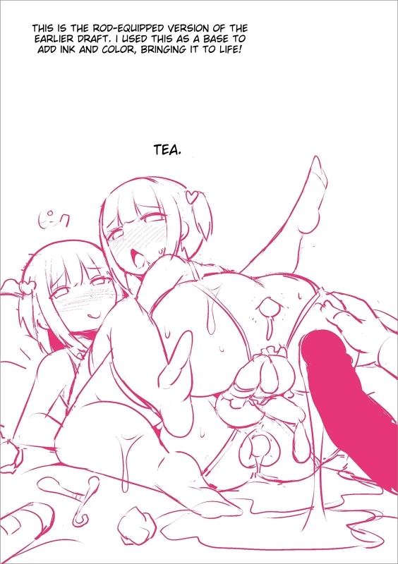
16/31THIS IS THE ROD-EQUIPPED VERSION OF THE EARLIER DRAFT. I USED THIS AS A BASE TO ADD INK AND COLOR, BRINGING IT TO LIFE! TEA.
THIS IS THE ROD-EQUIPPED VERSION OF THE EARLIER DRAFT. I USED THIS AS A BASE TO ADD INK AND COLOR, BRINGING IT TO LIFE! TEA.
 17/31
17/31From here* Complete recording of all names of works included in this magazine!!
From here* Complete recording of all names of works included in this magazine!!
 18/31
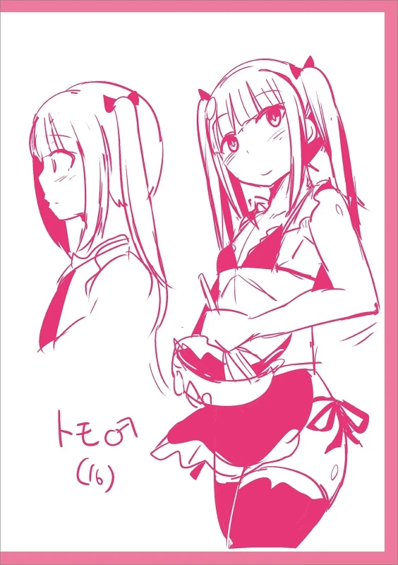
18/31-EO (16)
-EO (16)
 19/31
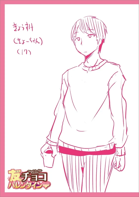
19/31(75-tth) (17)
(75-tth) (17)
 20/31
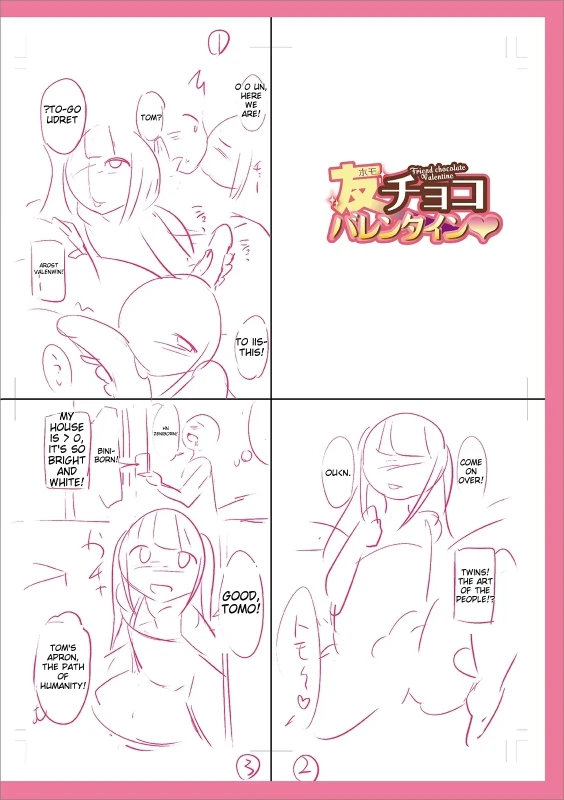
20/31UDRET PTO-GO TOM? WE TO IIS-THIS! HOUSE MY T'S SC BRIGHT BINI-WHITE! AND BORN! OLKN. COME OVER! ON TWINS! -TOMO! GOOD THE ART PEOPLE!? OF THE TOM'S THE PATH HUMANITY! OF
UDRET PTO-GO TOM? WE TO IIS-THIS! HOUSE MY T'S SC BRIGHT BINI-WHITE! AND BORN! OLKN. COME OVER! ON TWINS! -TOMO! GOOD THE ART PEOPLE!? OF THE TOM'S THE PATH HUMANITY! OF
 21/31
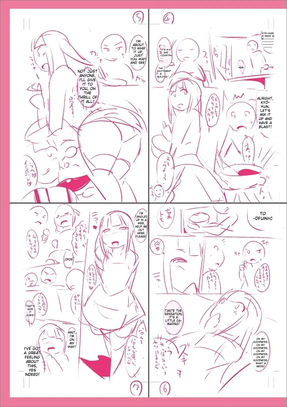
21/31KUN, -DFUINSC TO (1233) (402N IVE GOT ABOUT THIS INDEED! YES
KUN, -DFUINSC TO (1233) (402N IVE GOT ABOUT THIS INDEED! YES
 22/31
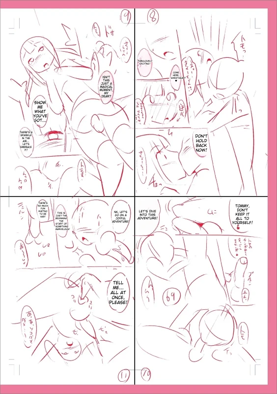
22/31YOU'VE GOT.. DON'T BACK LETO THIS ROVENTURE: ADVENTURE TOMMY KEEP IT DON'T YOURSELF! ALL ONCE • AT PLEASE!
YOU'VE GOT.. DON'T BACK LETO THIS ROVENTURE: ADVENTURE TOMMY KEEP IT DON'T YOURSELF! ALL ONCE • AT PLEASE!
 23/31
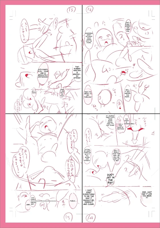
23/31MUIE Tijuli Ps -soc uY-prE 18-- preetm +=p-s NerUE G16 06 WAY! I TUST SHOULD BE
MUIE Tijuli Ps -soc uY-prE 18-- preetm +=p-s NerUE G16 06 WAY! I TUST SHOULD BE
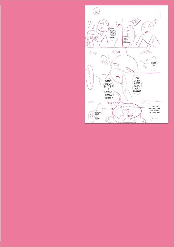 24/31
24/31ThEr LITTLE BUT RIGHT? TIMID. 6037399
ThEr LITTLE BUT RIGHT? TIMID. 6037399
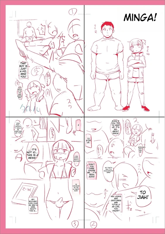 25/31
25/31MINGA! THIS IS NOT 10... AGES HIS LOOKS TO GESTURES AND JIAH! TOTALLY KNOW? AX-LIKE
MINGA! THIS IS NOT 10... AGES HIS LOOKS TO GESTURES AND JIAH! TOTALLY KNOW? AX-LIKE
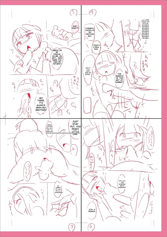 26/31
26/31ART CE
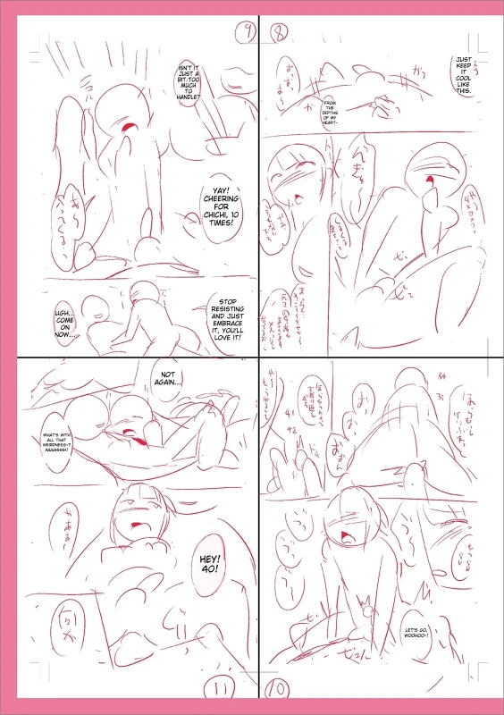 27/31
27/31CHEERNG YAY! CHICHI TIES! UGH. NON.. COME ON LOVE IT! GAN. -site
CHEERNG YAY! CHICHI TIES! UGH. NON.. COME ON LOVE IT! GAN. -site
 28/31
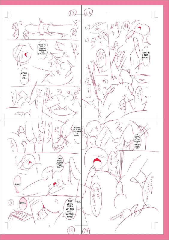
28/31TIGHT. GLUG! NATCHI HEAT,
TIGHT. GLUG! NATCHI HEAT,
 29/31
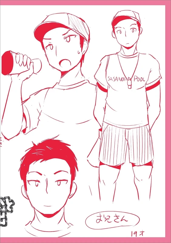
29/31SASANONE, POOL, J'2EL 19 ł
SASANONE, POOL, J'2EL 19 ł
 30/31
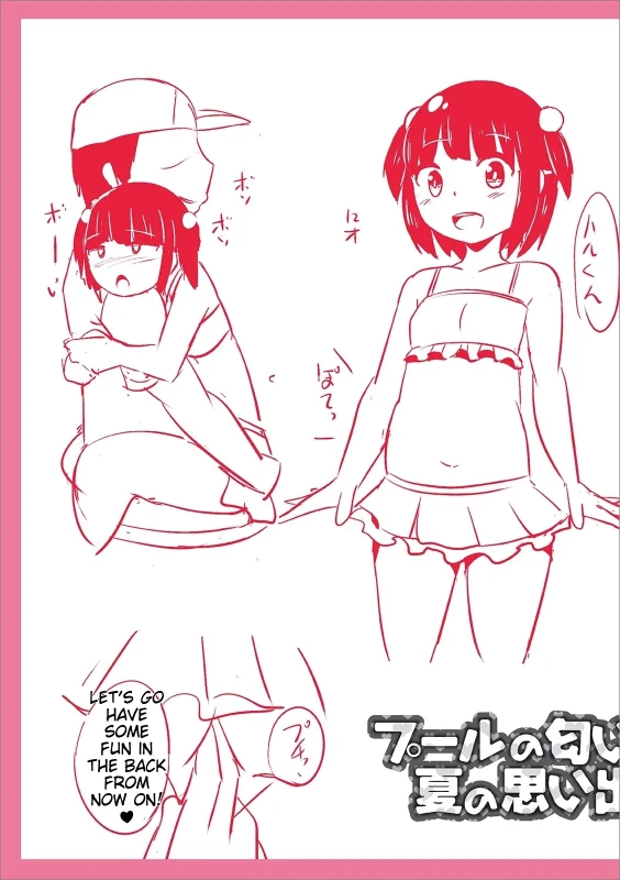
30/315rvs) LET'S GO HAVE FUN IN SOME THE BACK NOW ON. FROM FORCE
5rvs) LET'S GO HAVE FUN IN SOME THE BACK NOW ON. FROM FORCE
 31/31
31/31